Yet another geek blog
8 December 2008
Hot Air and Global Warming
When NASA sends probes to other planets they are never asked to justify how such places can be real if they are unimaginably far away. They are never criticised for wanting to study the atmosphere of Neptune rather than relying on common sense. Nor do they have to deal with the idea that the very fact that they are trying to find out proves that 'science does not know everything' and is therefore a waste of time.
This, of course, is because nobody has ever been upset by anything they ever heard about Neptune. When people hear about global warming on Earth, they hear lots of things that they do not like. And too often their reaction is to just drown out the bad news.
An excellent example is the blog of Roger Helmer a Member of the European Parliament. I have picked this blog because it is a better summary of the position than rambling rants on the subject.
He makes the following points that I will look at one at a time:
- We have good records about the past environment.
- The temperature rise over the last 150 years is consistent with the cycle for the last 10,000 years.
- We see warmer and cooler periods every 1200 years or so.
- The world is cooler now than it was during the Holocene Optima (sic), the Roman Optimum or the Mediaeval Warm period.
- CO2 levels have been much higher in the past and there was no 'tipping point'.
We have good records about the past environment
We do indeed. But it is important to remember that there is no one single source of information. They come from scattered locations and become less accurate the further back in time you go. Nevertheless, the boundaries of error are quite well understood and you cannot pick and choose when to heed it.
The temperature rise over the last 150 years is consistent with the cycle for the last 10,000 years
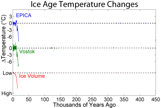
There are places in Antarctica where it snows every year but never thaws. The snow turns into layers of ice that preserve information (including temperature) about the time that the show fell. Here are some data from two such places:

The x-axis is 'thousands of years ago' so the present day is on the left.
This graph does indeed show the last 10 thousand years has show a steep increase in temperature from -6C to 1C. Case closed.
That graph looks awfully empty; what does the rest of it look like?
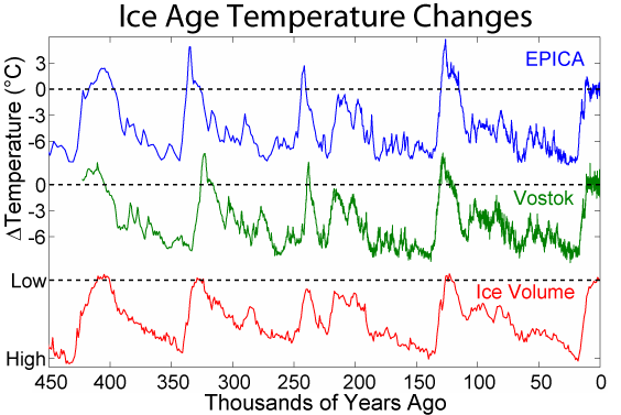
The 10 thousand year window has been chosen very carefully to include the ending of the last ice age. Take a look at the whole graph 1:

As you can now see, ice ages are regular events. It is also sobering to notice that they last far longer than periods between them.
But the cycle covers hundreds of thousands of years. There is nothing here that would be noticeable within the blink of a human lifetime. So the one degree temperature rise in the last century is not 'consistent' with the seven degree rise in the last 10 thousand years, it is huge acceleration.
Another thing that you can see from looking at the whole graph is where we are in the cycle. We are at a point of level-ish temperature, far closer to the beginning of the next ice age than the end of the last one. So any increase in temperature at this point is a break in the pattern.
We see warmer and cooler periods every 1200 years or so
and
The world is cooler now than it was during the Holocene Optima (sic), the Roman Optimum or the Mediaeval Warm period
You can indeed see from the full graph above that the temperature line is a jagged one, not a smooth one. But think again about the timescales. Glaciers advance and retreat, forests come and go.
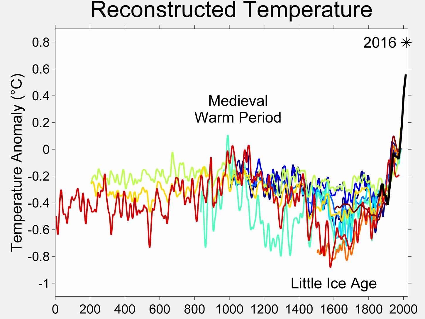
Here is a closer look at the las 12 thousand years, the flat-ish bit we are in now2.

This graph looks a lot messier because it shows data from more places. This is actually better because it means that the average temperature (the bold line) is much more reliable.
What support is here for the claim that the Holocene(Climatic) Optimum was warmer than today? You can raise the average by selectively ignoring colder data but that proves nothing because you can also do the opposite. You could also argue that because the data do not catch any changes of less than three centuries then the temperature might have been higher. By the same argument, they might have been lower.
Notice also, that the change from zero thousand years ago and 2004 is too steep to show at this scale, hence the inset.
Can we zoom in any further? Indeed we can2:

Here, the x-axis shows years AD so the present day is on the right. At last we are on a comfortable timescale.
There have certainly been changes. In the 9C there were vineyards in northern Britain and in the 17C public fairs were held on the frozen river Thames.
Again, there is nothing that suggests that the average global temperature approached today's level. If anybody has any data to the contrary then they must present it.
CO2 levels have been much higher in the past and there was no 'tipping point'.
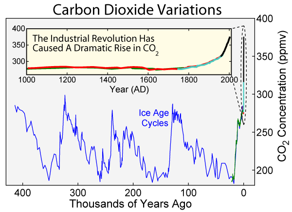
When? Antarctic ice has also recorded levels of carbon dioxide for the past 400 thousand years3:

None of the recorded levels are anything like the levels of today.
What is not Said
But the real problem with lists like the above it not what is said, but what is inferred. And the main inferences are that:
If you can pick holes in the Greenhouse explanation then global warming is not happening
Facts generate explanations but they are not generated by them. If you fall from a cliff you cannot avoid the ground by writing a witty critique of Newton's law of universal gravitation.
If global warming is happening it is natural and therefore alright
This is something we all need to be clear about. There are six billion people on our planet. We need to breath and eat. We are utterly dependant on the ecosystem to provide these things for us and we are appallingly vulnerable.
Says Who?
Sources
- Petit J.R., Jouzel J., Raynaud D., Barkov N.I., Barnola J.M., Basile I., Bender M., Chappellaz J., Davis J., Delaygue G., Delmotte M., Kotlyakov V.M., Legrand M., Lipenkov V., Lorius C., Pépin L., Ritz C., Saltzman E., Stievenard M. (1999) Climate and Atmospheric History of the Past 420,000 years from the Vostok Ice Core, Antarctica, Nature, 399, 429-436
- Climate Reconstructions. See also The climate of the Holocene
- Vostok Ice Core Data
Wikipedea
The graphs I have used were contributed to wikipedia by Dragons filght.
Denialism
- 2008 was the year man-made global warming was disproved
- Greenhouse gases could have caused an ice-age claim scientists (but see also Bad Science)
- CO2 Sceptics
Contact
Recommended Reading
- Bad Science
www.badscience.net - Evil Mad Scientist Laboratories
www.evilmadscientist.com - Skeptic
www.skeptic.com - Snopes
www.snopes.com - Null Hypothesis
www.null-hypothesis.co.uk
Previous Posts
- Embassytown by China Miéville
- Asylum of the Daleks
- The Long Earth by Terry Pratchett and Stephen Baxter
- My Dear Watson by Margaret Park Bridges
- Pavane by Keith Roberts
- The Further Adventures of Sherlock Holmes: War of ...
- Anno Dracula by Kim Newman
- The Windup Girl by Paolo Bacigalupi
- Some Animals are More Equal Than Others
- The City & The City by China Miéville
Geek Stuff
Subscribe to
Comments [Atom]
